Cafe Red
The largest project I’ve worked on to date...but it included much more than your standard brief. I designed everything from scratch, including branding, packaging, social media marketing pieces, signage, and menus, all while also installing electrical outlets, training new staff, and chasing down patio umbrellas.
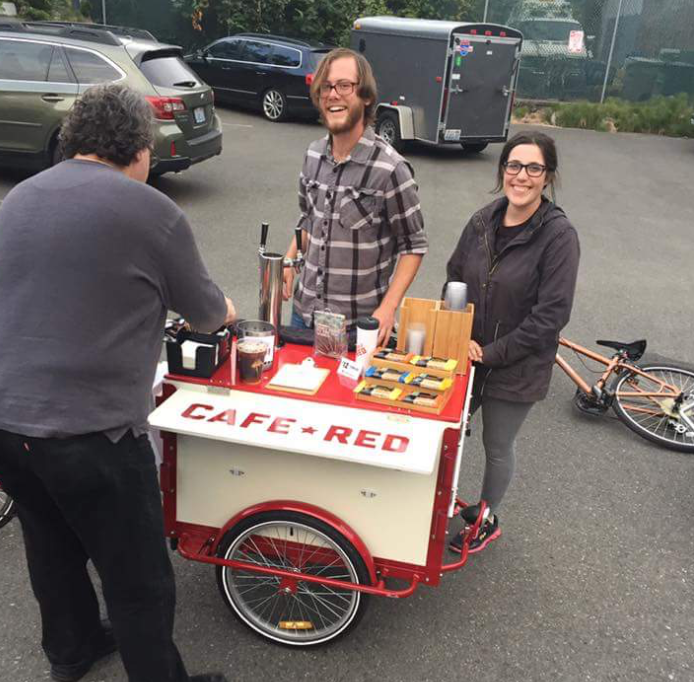
Rise & Shine: Bike-powered Cafe
Cafe Red started in 2015 as a bicycle-powered coffee cart, serving pour-over coffee from a propane stove, and cold brew and gourmet popsicles in the warmer months.
The logo drew inspiration from Constructivist art, symbolising coffee as a power to the people. It featured a strong geometric sans-serif with a subtle tilt to echo that era, while the cheerful character at the end added a friendly touch of quirkiness.
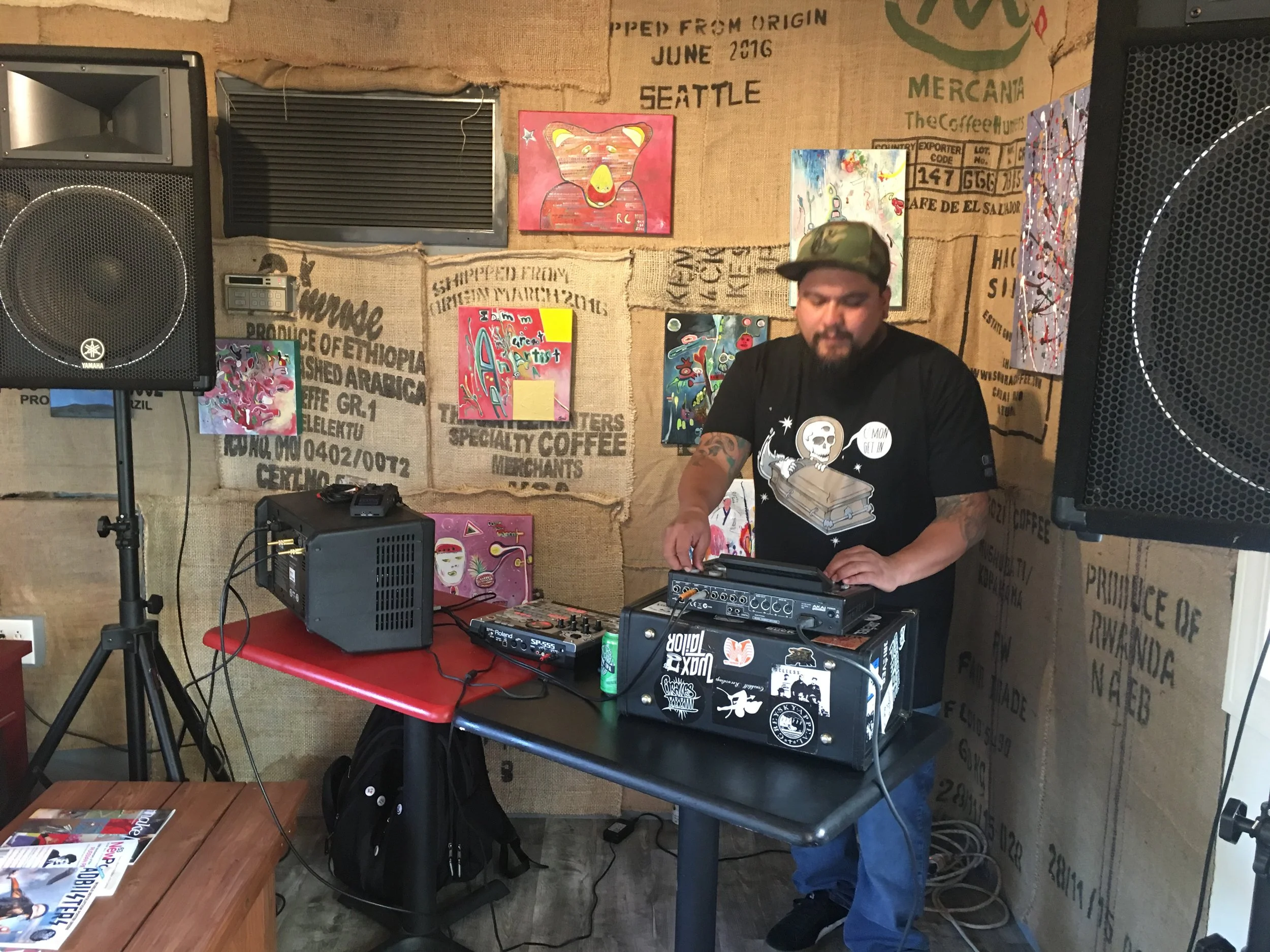
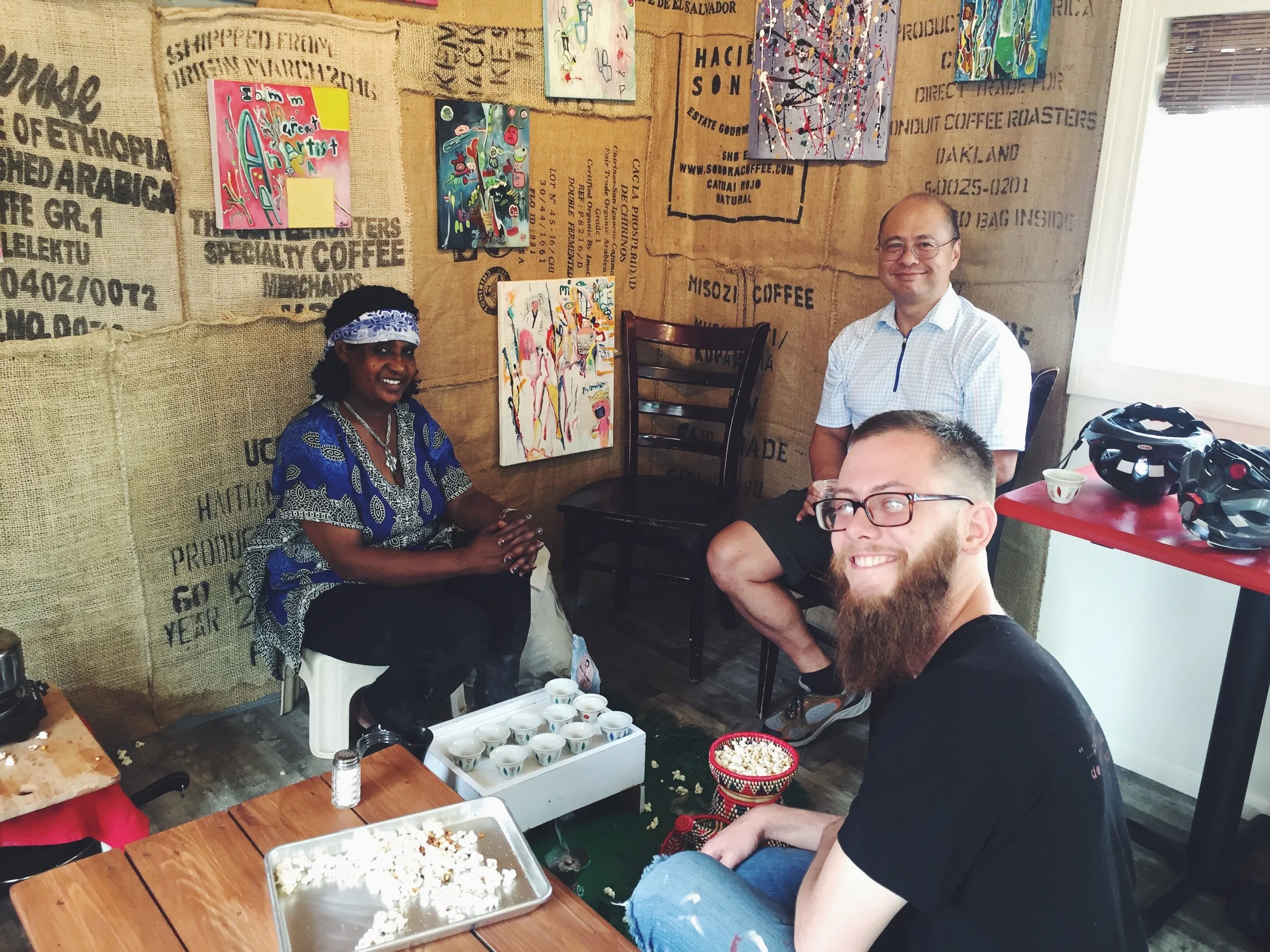
We parked at South Park, Columbia City, and Othello, where the closest place for a decent cup was a Starbucks kiosk in a Safeway. Our cart brought darn good coffee and friendly chat to the neighbourhoods.

Brick & Mortar
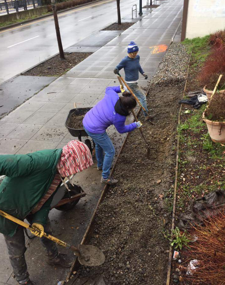
Eventually (mercifully) we found a permanent home: a converted construction office trailer. It wasn’t glamorous, but it had walls and a roof, which was a big upgrade. Through our time as a bike cart, we gained invaluable on-the-ground insight into the neighbourhood, where we learnt the rhythms, values, and personality of South Seattle and the Othello community. This became the foundation of our brand.
Many speciality coffee shops in the Pacific Northwest lean toward minimalism: concrete everything, lots of white and grey and ecru. But that didn’t reflect the colourful, multicultural spirit of our neighbourhood. So we made a different choice.
Our brand would be:
Friendly: approachable for everyone, no matter their coffee knowledge or walk of life
Fun: vibrant and vivacious
Bold: visually and culturally
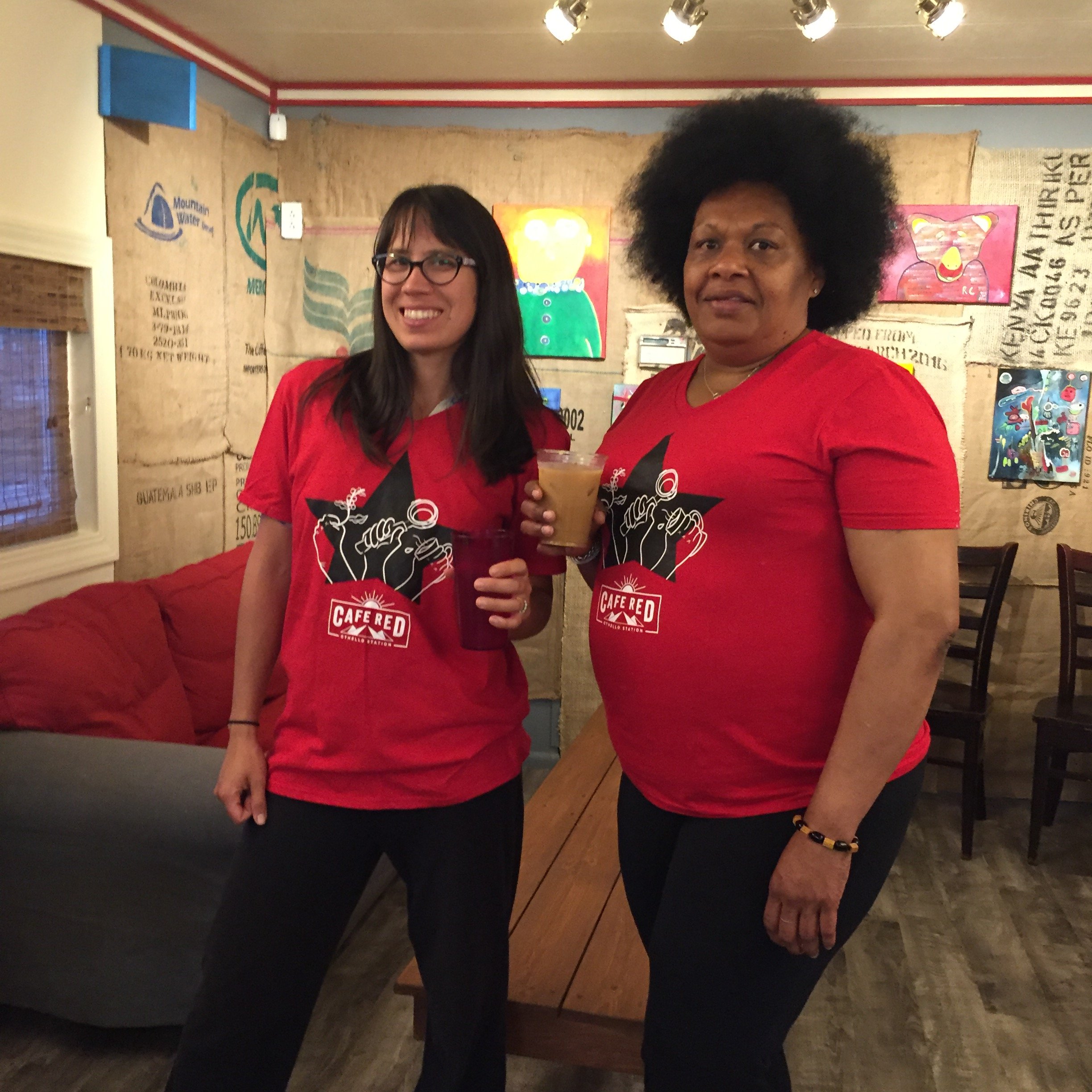
This philosophy influenced everything from our logo and colour palette to event posters, interior signage, and even sandwich names (I’m lookin’ at you, Vegan Morgan).
The Logo
The logo went through several iterations before we landed on the final version. While the original logo captured the theme, we wanted a direction that felt more open, friendly, and distinctive.
The final design features sun rays and mountains, representing both the Pacific Northwest landscape and coffee-growing regions. We paired this with a tall geometric sans-serif with rounded corners, echoing the logomark’s curved strokes and creating a softer, more approachable feel.

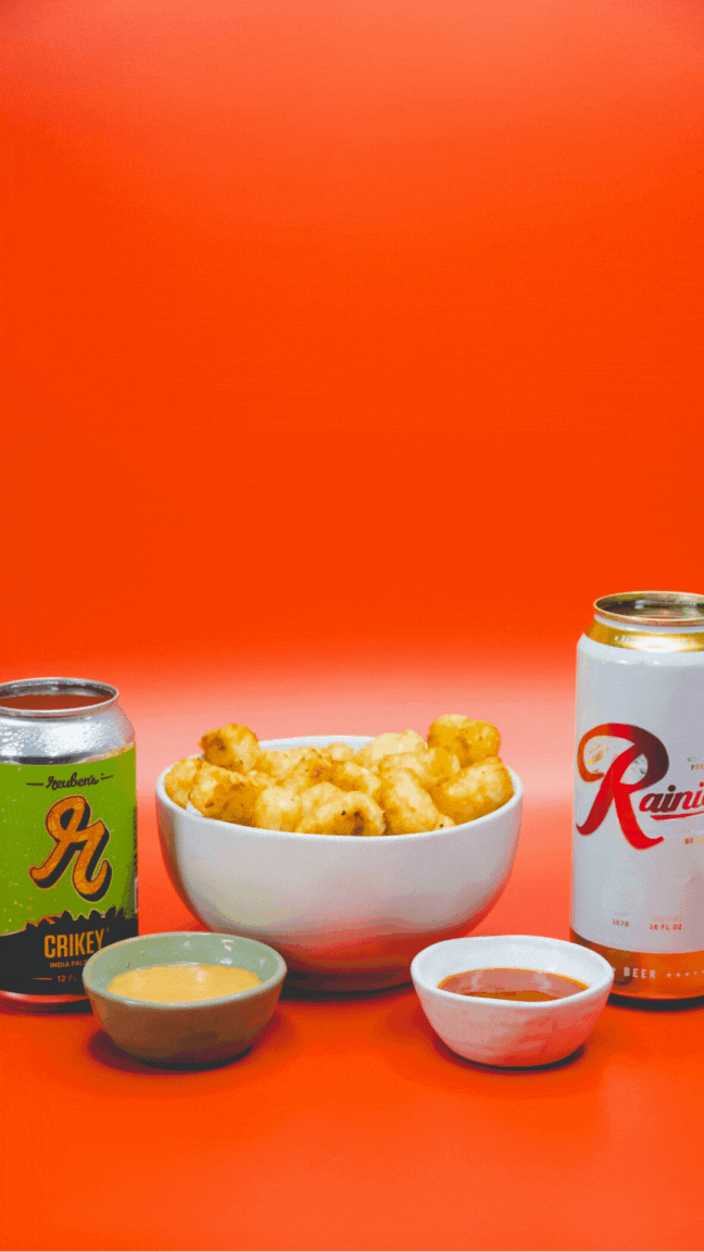
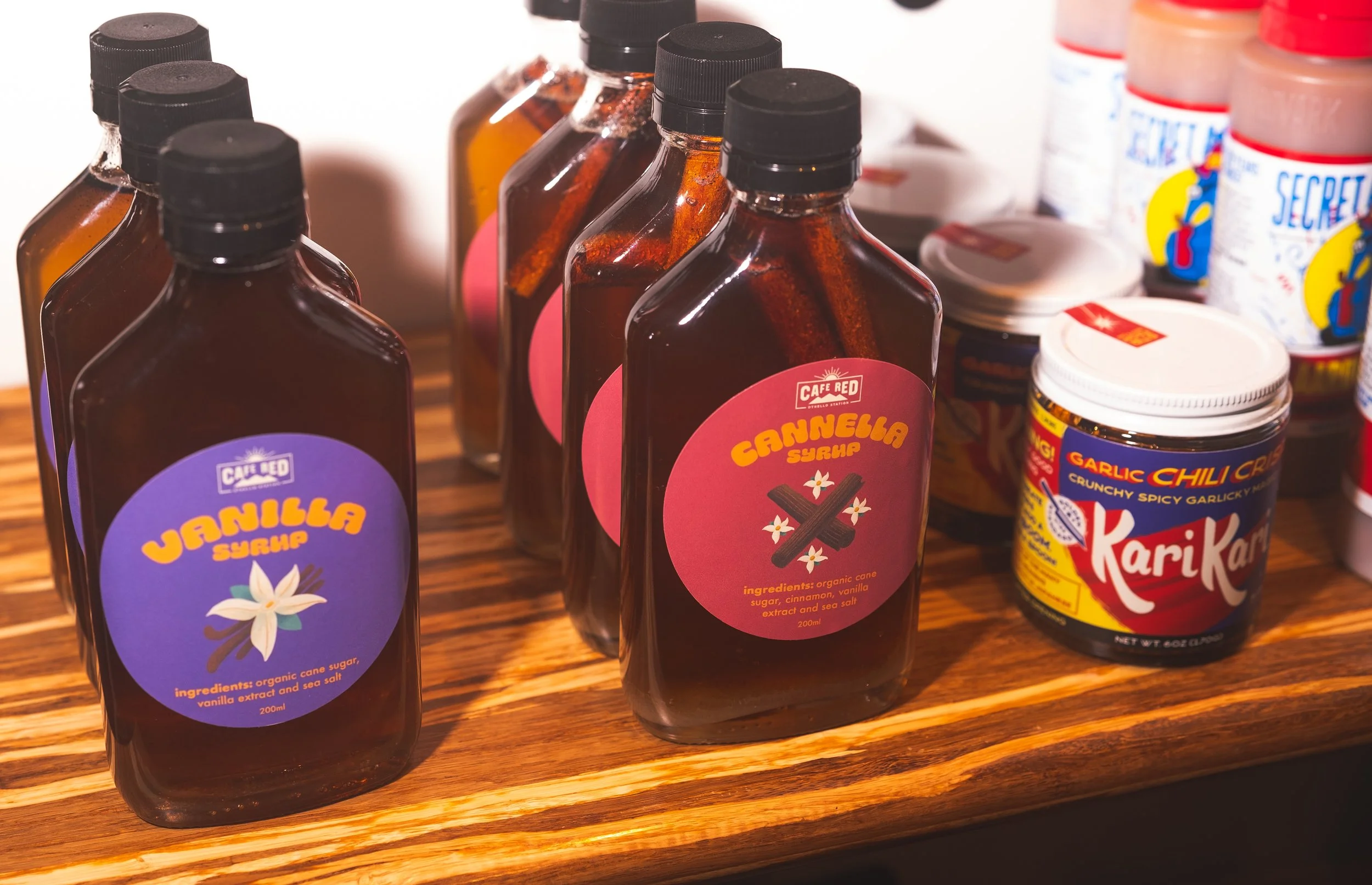
Menus & Packaging
To align with our ethics, we shifted to an entirely plant-based menu, which was an existential risk: would customers miss eggs and dairy and never return? We focused on making the new offerings delicious first, vegan second.
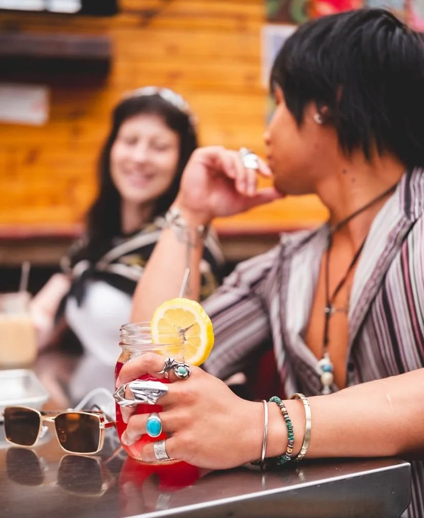
Researching other speciality cafes in Seattle, we noticed many leaned toward minimalist, all-white aesthetics. To stay true to our core values of friendliness and inclusivity, as well as the eclectic, lively character of South Seattle, we embraced bold, playful design instead.
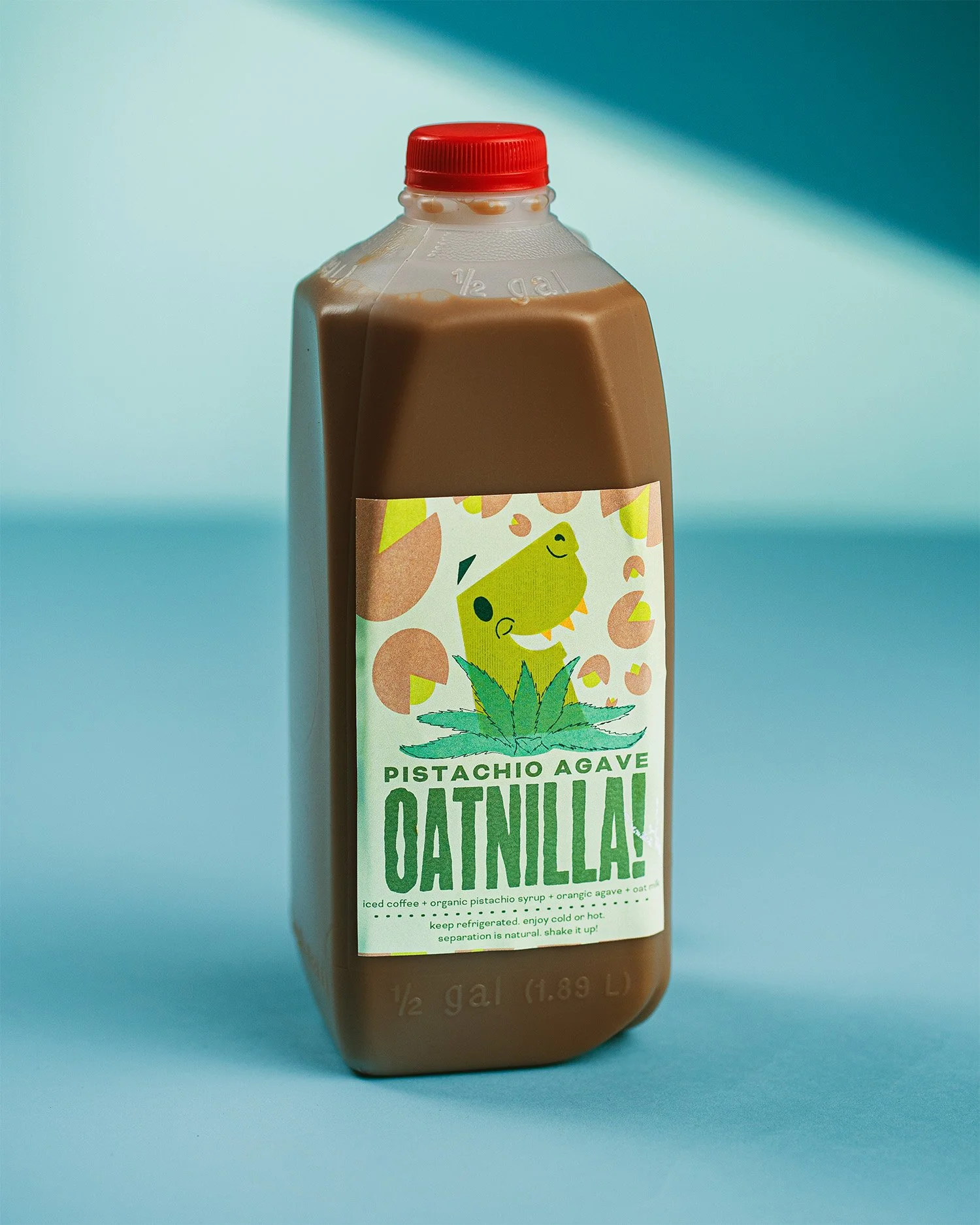
Targeting Millennials and Gen Z, the menu and packaging feature custom illustrations, joyful anthropomorphised food and drinks, and our signature Oatnilla character for the cold brew latte. Eye-catching colours pair with off-kilter typography: Chee for headlines, Retail Display for subheads and descriptions. It’s meant to evoke sunshine in a cup (and/or breakfast burrito).
So how did it go? The rebrand proved successful: despite the risk of going fully vegan, average daily sales more than doubled from $830 in 2019 to $1820 in 2022. The cohesive visual identity helped customers embrace the plant-based pivot while attracting new audiences drawn to our values-led approach.


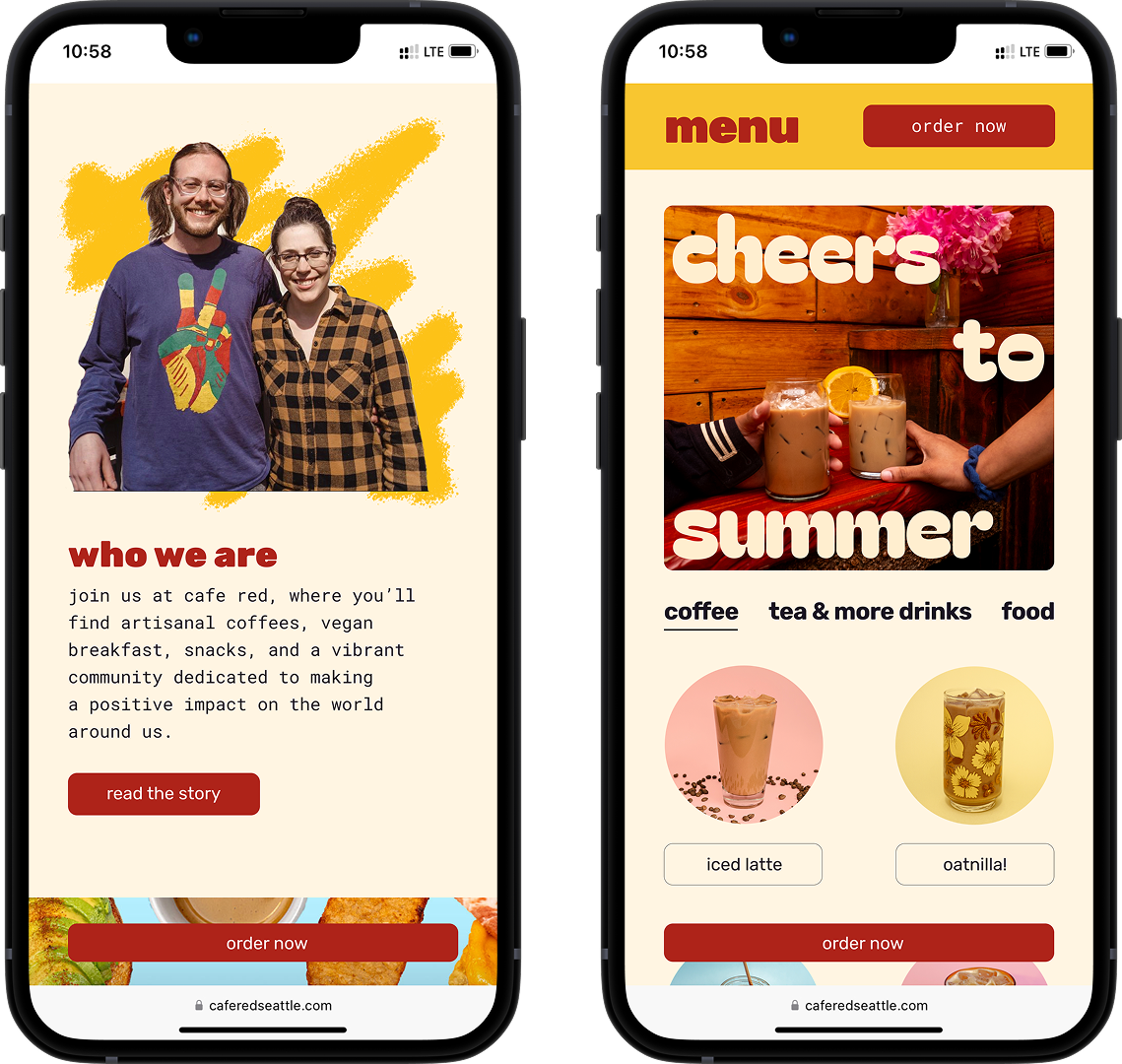
Website
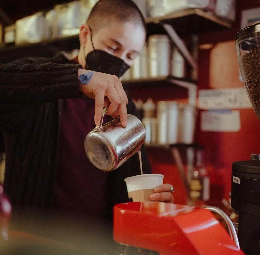
The website extends our vibrant, playful brand online—featuring the same bold colors and cheerful illustrations that make our physical space feel welcoming. Visitors can explore our story, discover our local partners (including several POC-owned suppliers), and easily order products for pickup or delivery. The casual, friendly tone reflects our commitment to making specialty coffee approachable.


Social Media
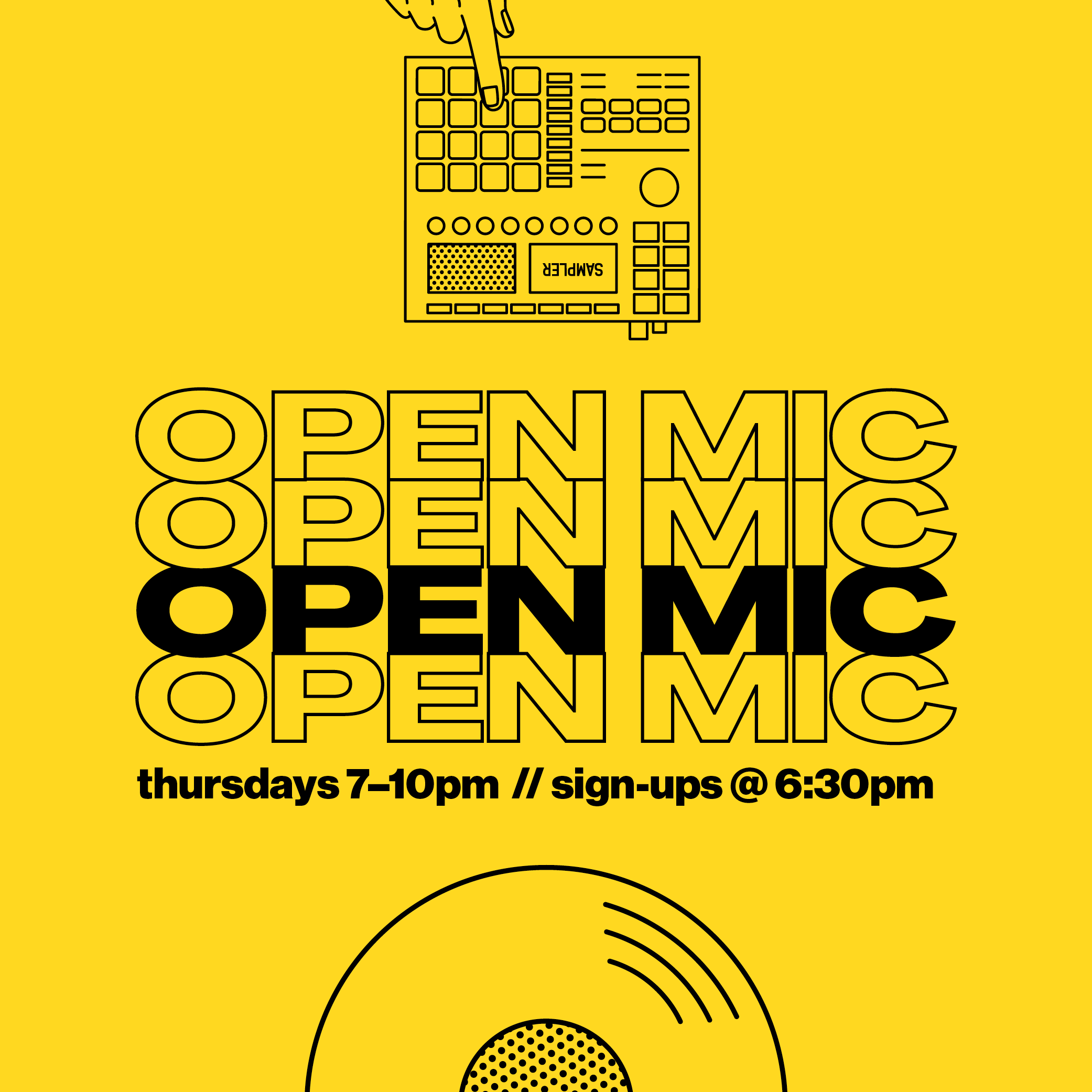
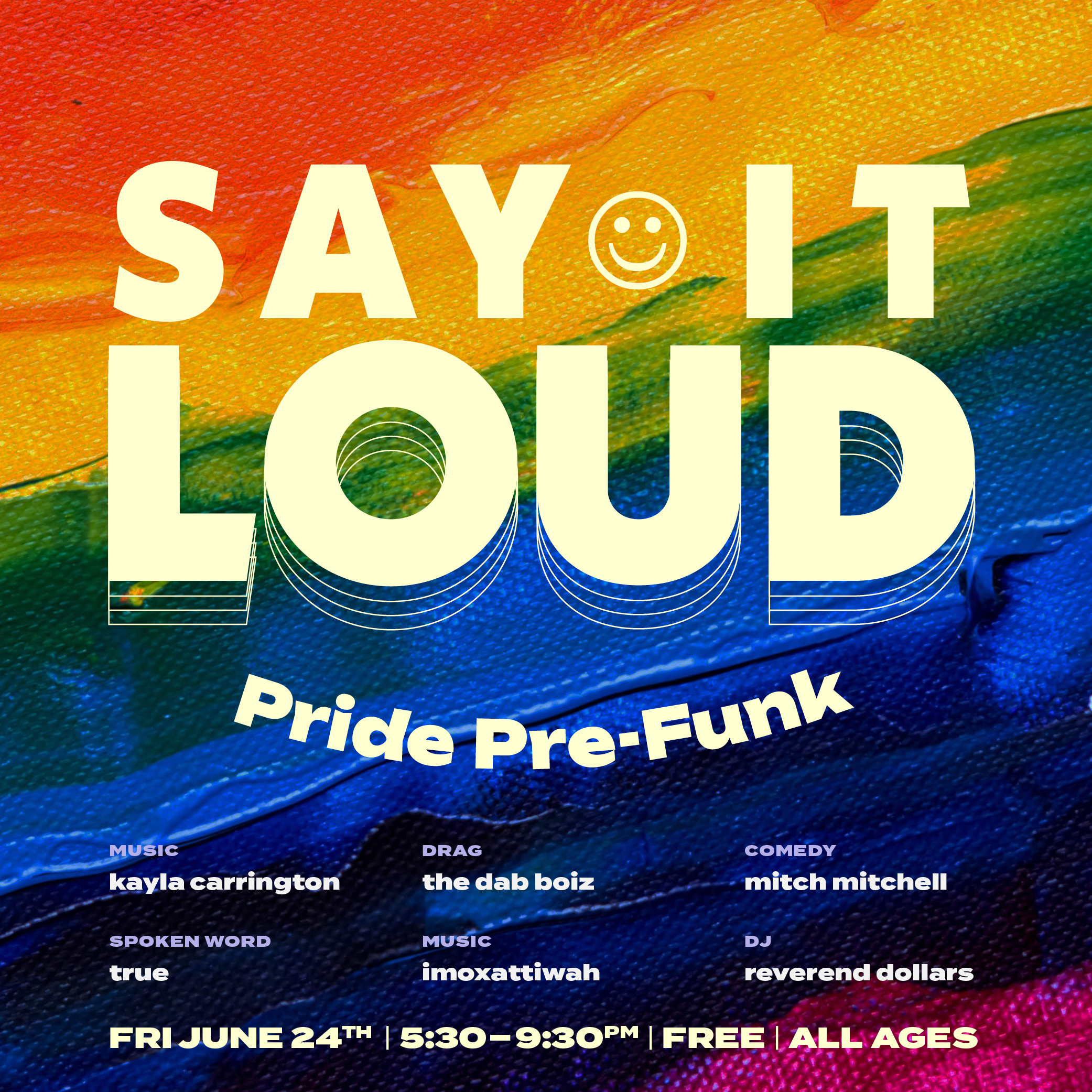
We collaborated with local photographers to capture our products and community in a style that felt warm and authentic. We also created event graphics for open mics, jazz nights, and other community programming, using a bold colour palette and playful typography to make each event feel exciting. Many of these events provided performance opportunities for neighbourhood musicians.
Through word-of-mouth, print posters, and social media campaigns, we grew weekly attendance from just a few people to an average of over 40, with attendees regularly sharing positive feedback. One participant said, "Thank you for tonight's open mic, this was lovely and grounding," capturing the warm, inclusive vibe we aimed to create. This growth reflected our design strategy — making community events feel celebratory and accessible.